반응형
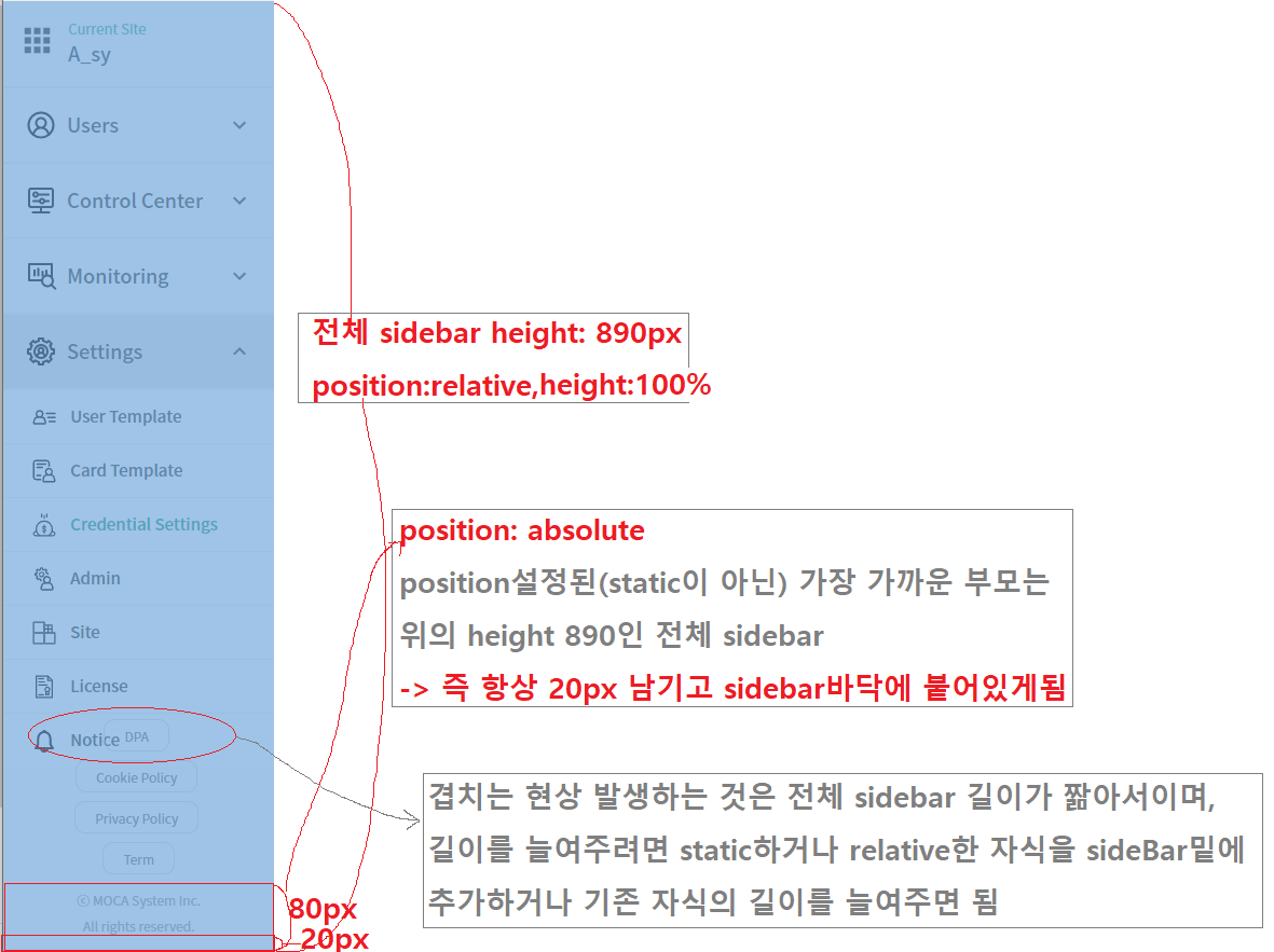
-> 예전에 정리한 자료인데 다시 보니 잘 이해안됨;
display: block, height:100%이면 height는 부모나 자식을 자르지 않고 다보여주는 방향으로 결정되는 듯
그래서 height늘이려면 간단히 자식의 길이를 늘이거나 추가하면 됨
반응형
|
-> 예전에 정리한 자료인데 다시 보니 잘 이해안됨;
display: block, height:100%이면 height는 부모나 자식을 자르지 않고 다보여주는 방향으로 결정되는 듯
그래서 height늘이려면 간단히 자식의 길이를 늘이거나 추가하면 됨
html 태그나 element 등은 기본적으로 순서대로 작성됨
그런데 position을 사용하면 코드 순서와 상관없이 원하는 곳에 그려낼수 있음
position따로 지정하지 않으면 defaut로 static인데, 이 static이 뭔지를 이해해야함 -> 코드 순서대로 그려지는 상태
position을 absolute나 fixed로 설정시 가로 크기가 100%가 되는 block 태그의 특징이 사라지게 된다고 함(https://ofcourse.kr/css-course/position-%EC%86%8D%EC%84%B1)
| display:block에서 정렬이 들쑥날쑥해지는 이유 - text baseline을 기준으로 정렬되기 때문 - vertial-align: text-top으로 해결가능 (0) | 2024.04.26 |
|---|---|
| css position: sideBar overlap error (0) | 2024.04.25 |
| 아래를 다 가리는 loading indicator (0) | 2024.04.25 |
| 우측정렬: text-align: right | display:flex, justify-content:flex-end | (0) | 2024.03.27 |
| 경로를 나타내는 href, src, url 차이: CSS(항상 url), HTML(link이면 href, link아닌 이미지나 비디오 등등이면 src) (0) | 2024.03.27 |
#FFFFFF: white
#000000: black
R #FF0000: red
G #00FF00: lime (흔히 아는 그린색은 아니고 라임색, 형광연두같은 색)
B #0000FF: blue
| css variable - color에 사용하면 좋음: var(--LG-Red) (0) | 2024.06.21 |
|---|---|
| color keyword: black, gray=grey, lightgray=lightgrey, gainsboro(A light bluish grey colour, 옅은푸른빛회색) (0) | 2024.04.25 |
https://developer.mozilla.org/ko/docs/Web/CSS/color_value
<color> - CSS: Cascading Style Sheets | MDN
CSS <color> 자료형은 색을 나타냅니다. <color>는 이 색이 배경과 어떻게 합성되어야 하는지 나타내는 알파 채널 투명도 값도 가질 수 있습니다.
developer.mozilla.org
| css variable - color에 사용하면 좋음: var(--LG-Red) (0) | 2024.06.21 |
|---|---|
| color: #ffffff(white), #000000(black) (0) | 2024.04.25 |
전체화면 덮는 역할
.loading-wrap {
display: flex;
flex-direction: column;
align-items: center;
justify-content: center;
position: fixed; 전체화면 다 차지하고 위치 고정되도록
width: 100%;
height: 100%;
background-color: #0002; 색깔 회색으로, #0002보고 당황하지 말자 #NNNNNN형식에서 줄인듯
.modal {
position: fixed; 전체화면 다 차지하고 위치고정되도록
top: 0;
left: 0;
right: 0;
bottom: 0;
background-color: rgba(0, 0, 0, 0.5); 아래를 흐리게 만드는 역할
display: flex;
flex-direction: column;
align-items: center;
justify-content: center;
}
여기에 z-index 가장 큰 값 주면 그 위에 뭐가 더 덮일일이 없음, 뭐가 더 덮이면 정상동작안하게 되므로
| css position: sideBar overlap error (0) | 2024.04.25 |
|---|---|
| css position: static(default), relative, absolute, fixed (0) | 2024.04.25 |
| 우측정렬: text-align: right | display:flex, justify-content:flex-end | (0) | 2024.03.27 |
| 경로를 나타내는 href, src, url 차이: CSS(항상 url), HTML(link이면 href, link아닌 이미지나 비디오 등등이면 src) (0) | 2024.03.27 |
| getMaxZIndex (0) | 2024.03.04 |
| 두번째 input부터만적용 input + input { margin-top: 10px; } (0) | 2024.06.20 |
|---|---|
| .popupModal [class="image"] exact css class match (0) | 2024.06.18 |
| css selector(#id,.class, 자손,>자식), table tag (0) | 2019.04.19 |
1) text-align: left/center/right;
block 요소안의 inline 요소를 정렬할 때 사용
다른 요소들이 없을때 가능-어떤것 오른쪽으로 어떤건 왼쪽으로 이렇게 하려면 flex를 이용해야 함
2) display: flex, justify-content: flex-start/center/flex-end;
1) 2) 샘플 참고: https://hianna.tistory.com/837
그런데 위의 1) 2)는 바로 위 부모 밑에 모든 애들이 다 한 방향으로 정렬되게 되어 있음
기본은 좌측정렬이고 마지막만 우측정렬하려면
3) display: flex, justify-content: flex-start/center/flex-end; 설정해두고 우측 정렬할 것만 margin-left: auto
참고: https://smthousand.tistory.com/28
1) 2) 3) 모두 바로 위 부모 밑 자식에게 적용가능함
할아버지 할머니에 비교해서 왼쪽 정렬되게 하려면
4) position: absolute 이용
할아버지 할머지는 position: relative로 설정, 우측 정렬하고 싶은 손주는 position: absolute, right:0
5) display: flex, justify-content: space-between 해주면 2개자식이 있을 때 최대한 멀리 떨어뜨려줌, 자식이 3개일때는?
6) display: flex, 첫번째 자식을 display:flex, flex-grow:1 해주면 됨 왜그런지는?
| css position: static(default), relative, absolute, fixed (0) | 2024.04.25 |
|---|---|
| 아래를 다 가리는 loading indicator (0) | 2024.04.25 |
| 경로를 나타내는 href, src, url 차이: CSS(항상 url), HTML(link이면 href, link아닌 이미지나 비디오 등등이면 src) (0) | 2024.03.27 |
| getMaxZIndex (0) | 2024.03.04 |
| [z-index]x,y,z좌표를 생각하자 - 값이 높을수록 위에 있음 (0) | 2024.03.04 |
| 아래를 다 가리는 loading indicator (0) | 2024.04.25 |
|---|---|
| 우측정렬: text-align: right | display:flex, justify-content:flex-end | (0) | 2024.03.27 |
| getMaxZIndex (0) | 2024.03.04 |
| [z-index]x,y,z좌표를 생각하자 - 값이 높을수록 위에 있음 (0) | 2024.03.04 |
| (<input>안에뭐쓰면에러남</input>)input is a void element tag and must neither have `children` nor use `dangerouslySetInnerHTML` (0) | 2024.01.18 |